Blog

Written by

Feb 12, 2026
Leonardo C.
Our frontend was built on Material UI. It's probably the most popular React component library out there — solid components, good docs, and Google's design language out of the box.
But MUI has a problem. The more your product develops its own identity, the more you fight the framework.
The sx prop problem
MUI gives you a design system. That's great when you want Material Design. When you don't, every component becomes a negotiation.
Your designer specs a card with custom padding. You override it with sx. Your teammate does the same thing on another page, slightly differently. Someone else uses styled(). Someone gives up and writes inline CSS.
You end up with three different styling approaches in one codebase, a theme config that nobody fully understands, and new engineers asking "which way do I do this?" on their first PR.
We reached a point where styling took longer than building features.
Why we picked Tailwind
We looked at Chakra, Ant Design, Mantine. They're good libraries, but they have the same fundamental tradeoff — you get a lot until you need something they didn't account for.
Tailwind is different because it's not a component library. It's a constraint system.
p-4 text-sm text-onyx-60 picks from a fixed set of values. You can't invent a spacing unit. You can't eyeball a color. The design system is the utility classes.
Paired with Shadcn/UI, we get accessible components built on Radix that we copy into our repo and own. No package dependency. No upstream breaking changes. Just code we control.
Same button. All the styling decisions live inside the component definition, not scattered across application code.
How we did it
Design tokens first
Before touching any components, we defined our visual language as CSS variables in one file.
We created custom color scales that match our Figma variables exactly:
sapphire— primary actionsonyx— neutrals for text, borders, backgrounds (14-stop scale)ruby,emerald,topaz,lapis— semantic status colors
When an engineer needs a border color, it's onyx-8. Secondary text is onyx-60. No guessing.
Shared component library
We took Shadcn/UI components and shaped them to our design language. Buttons, inputs, cards, dialogs, dropdowns, tables, badges. Every component uses CVA for variants and a cn() helper for class composition.
Incremental migration
No rewrite. No feature freeze. We migrated one module at a time alongside regular product work. MUI and Tailwind coexist fine, so there was no pressure to rush.
Full removal
Once we hit critical mass, we removed MUI entirely. Every data table, every date picker — gone. TanStack Table replaced MUI's DataGrid.
Other teams keep MUI around for the complex stuff. We didn't want two styling systems. Two systems means two mental models, two conventions, two answers to "how do I build this." That ambiguity has a cost, and you pay it every day.
What changed
Speed. What you read in JSX is what renders. No jumping between files, no digging through theme overrides to understand why something looks wrong.
Consistency. The token system only has the right options. Engineers pick the right colors and spacing without thinking about it. The product looks like one product.
Onboarding. New engineers learn the tokens, learn the shared components, start shipping. There's no "MUI theme config" onboarding step anymore.
Reviews. Same pattern in every file. No context-switching between styling paradigms.
The part we didn't expect: Figma to code
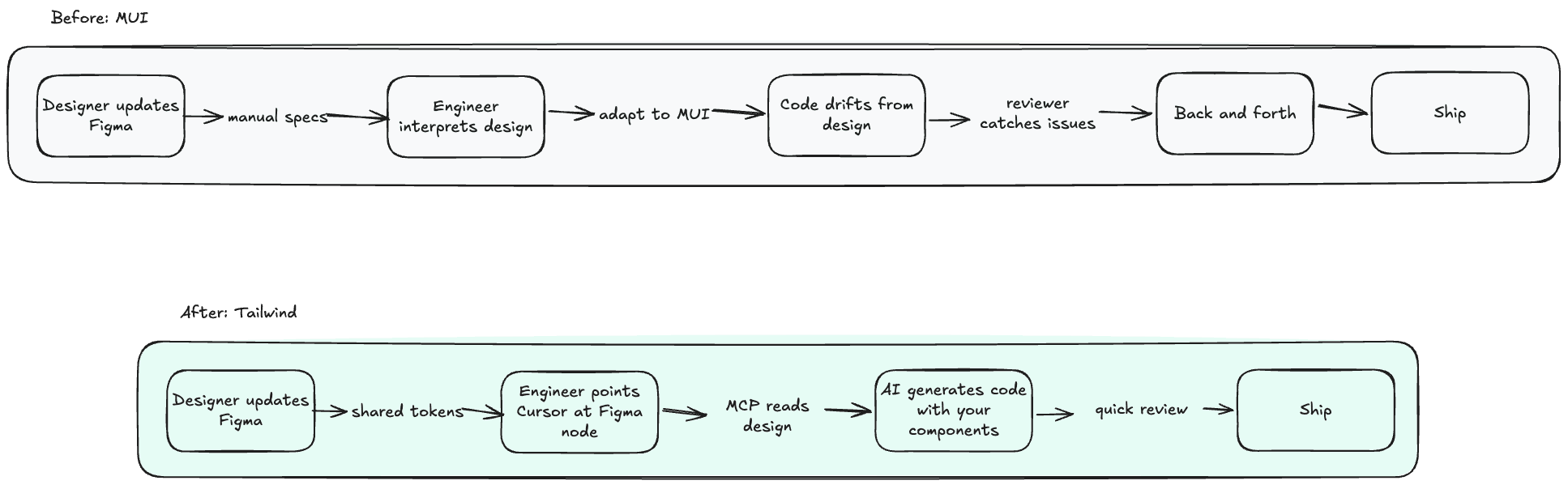
With MUI, there's a wall between Figma and your frontend. The rendered DOM is opaque — nested divs, injected Emotion classes, generated style tags. Nobody maps Figma components to what MUI actually produces.
When you own every layer — Radix for behavior, Tailwind for styling, your tokens for values — there's a direct relationship between Figma and code.
The sapphire in Figma is the same --sapphire in CSS. Your <Button variant="primary" size="sm"> renders exactly the markup you wrote.
This matters because of MCP (Model Context Protocol). AI tools can now talk to Figma through standardized integrations. A designer updates a screen, an engineer opens their editor, points at the Figma node, and the AI generates code using your actual components and tokens.
Not a generic approximation. Your design system.
This only works because the components are plain code in our repo. With MUI, the AI would have to reason through theme overrides and Emotion's runtime styling. That abstraction becomes noise.
Figma Code Connect makes it even tighter — you explicitly map code components back to Figma components, so the link is declared, not inferred. We set this up in an afternoon. The difference in handoff speed was immediate.
If you're considering this
Start with tokens. Name them to match your Figma variables. That decision pays off every time someone — or an AI — translates a design into code.
Use Shadcn/UI. Own the component code instead of depending on a package. As a side effect, your components become readable to AI tools.
Set up Code Connect. Map shared components back to Figma. Small investment, big compounding return on design-to-code handoff.
Commit fully. Two styling systems is worse than either one alone. Especially with AI workflows — the model can't generate reliable code when half your app uses Tailwind and the other half uses MUI theme overrides.
Use Tailwind v4. CSS-native config, automatic content detection, the @theme directive. If you bounced off v3, v4 is worth another look.
Where we are now
React, TypeScript, Tailwind v4, Shadcn/UI. No MUI. One styling approach across the whole codebase.
Features ship faster. The UI is consistent. Design-to-code handoff actually works. Nobody has asked to go back.
We're hiring
Artifact is where top engineers come to do the best work of their careers. Small team, hard problems.
Think you belong here? Apply now
Read more

Apr 7, 2026
Stop Turning Accountants Into Reviewers. Start Transforming the Work.

Mar 11, 2026
The CAS Paradox: Why the Fastest-Growing Service Line Is the Hardest to Scale
Eighty-five percent of Top 100 firms are growing CAS. So why does scaling it still feel so hard? The answer isn't talent or technology. It's the infrastructure layer connecting them.

Feb 20, 2026
Your System of Record Works. It Just Wasn't Built for What Comes Next.
State of CAS 2026
" height="13.637500000000001px" id="AujN8XCNe" transform="translate(7.682 0.516)" width="7.56520157561298px"/><path d="M 13.744 1.5 L 0.586 1.5 C 0.266 1.5 0 1.16 0 0.75 C 0 0.34 0.266 0 0.586 0 L 13.744 0 C 14.064 0 14.33 0.34 14.33 0.75 C 14.33 1.16 14.064 1.5 13.744 1.5 Z" fill="rgb(0, 0, 0)" height="1.5px" id="vjsUICxAi" transform="translate(0.75 6.584)" width="14.33px"/></g></svg>)
" height="13.637500000000001px" id="MCjnIPY7A" transform="translate(7.682 0.516)" width="7.56520157561298px"/><path d="M 13.744 1.5 L 0.586 1.5 C 0.266 1.5 0 1.16 0 0.75 C 0 0.34 0.266 0 0.586 0 L 13.744 0 C 14.064 0 14.33 0.34 14.33 0.75 C 14.33 1.16 14.064 1.5 13.744 1.5 Z" fill="rgb(255, 255, 255)" height="1.5px" id="xsDTgEJli" transform="translate(0.75 6.584)" width="14.33px"/></g></svg>)